
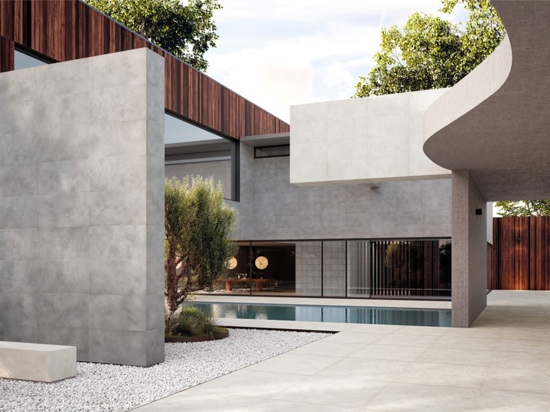
Colour is one of the most influential elements in design. Beyond defining the aesthetic identity of a space, it shapes the way interiors are perceived, affecting brightness, proportions and atmosphere. Whether creating a calm, understated environment or a kitchen with a stronger visual presence, the choice of colour contributes to the overall balance of the room.
Porcelain stoneware offers a wide variety of shades, finishes and material inspirations, allowing designers and homeowners to achieve cohesive, contemporary interiors without compromising performance.
Selecting the right palette is therefore about more than personal taste. It requires considering how colours interact with light, architecture and the surrounding materials to create spaces that remain elegant and functional over time.
How colour shapes the perception of kitchen spaces
Colour has a remarkable ability to influence spatial perception. Lighter tones naturally reflect more light, helping kitchens feel brighter, more open and visually expansive. This makes them particularly effective in compact interiors or spaces with limited natural daylight.
Darker shades, on the other hand, introduce depth and sophistication. When used thoughtfully, they can emphasise architectural features, define focal points and create a more intimate atmosphere without making the room feel enclosed.
The amount of natural light entering the kitchen should always guide colour selection. A palette that appears warm and welcoming in a sunlit room may produce a very different effect in a north-facing interior. Evaluating colour alongside lighting conditions allows surfaces to express their full aesthetic potential while maintaining visual comfort throughout the day.
Choosing a colour palette that complements contemporary interiors
Contemporary kitchens often favour restrained colour schemes that emphasise harmony rather than contrast. Soft greys, warm beiges, ivory tones and subtle earth-inspired shades provide a versatile foundation that complements a wide variety of architectural styles and furnishings.
These neutral palettes also enhance the versatility of tiles for kitchen, allowing porcelain stoneware surfaces to integrate naturally with changing design preferences over time. Material-inspired finishes, including stone, concrete and marble effects, further enrich the composition by introducing visual depth while preserving chromatic consistency.
Rather than following short-lived colour trends, contemporary interiors often benefit from carefully balanced palettes that create continuity across floors, walls and adjacent living areas.
Balancing kitchen tiles with cabinetry, worktops and lighting
A successful kitchen colour palette depends not only on the tiles themselves, but also on their relationship with surrounding materials. Cabinetry, worktops, shelving and metallic finishes all contribute to the overall visual composition, making coordination essential.
Warm wood cabinetry pairs naturally with earthy tones and stone-inspired porcelain surfaces, creating welcoming interiors with a refined character. Cooler shades, meanwhile, work particularly well alongside minimalist furniture, brushed metals and contemporary finishes, reinforcing a clean architectural language.
Artificial lighting should also be considered as part of the design process. Different light sources can alter the appearance of colours throughout the day, highlighting subtle tonal variations or changing the perceived warmth of a surface.
Timeless colour choices for kitchens that evolve gracefully
Kitchen surfaces are designed to last for many years, making colour selection an important long-term decision. While bold shades can introduce personality, timeless palettes often provide greater flexibility as interior styles evolve.
Neutral colours, balanced contrasts and natural material inspirations offer enduring appeal because they adapt easily to changing furnishings and decorative elements without requiring major renovations. Their understated elegance creates interiors that remain contemporary beyond seasonal design trends.
Ultimately, choosing the right colour palette means balancing personal expression with lasting design quality. By carefully considering light, surrounding materials and spatial harmony, porcelain stoneware surfaces can help shape kitchens that feel welcoming, sophisticated and relevant for years to come.
Ceramiche Refin: experience, research and quality serving contemporary design
Every architectural project is shaped by a balance of creativity, technical expertise and manufacturing precision. This philosophy has guided Ceramiche Refin since 1962, enabling the company to establish itself as an international reference in Italian porcelain stoneware.
As part of the Concorde Group, the brand continues to combine aesthetic research, technological innovation and a strong manufacturing culture, developing surfaces that respond to the evolving needs of architects, interior designers and design professionals.
This commitment is supported by a fully integrated production model, where every stage – from concept development and technical engineering to quality control – is managed in house. Alongside product excellence, Ceramiche Refin embraces responsible manufacturing through low-impact technologies, waste recovery systems, reduced emissions and the efficient use of resources.
The breadth of the company’s collections reflects its ability to interpret a wide variety of architectural languages while maintaining a consistent design vision. For projects seeking the timeless elegance of marble-inspired porcelain stoneware, PRESTIGIO KALEIDOS explores the relationship between material and light through layered reflections, rich chromatic nuances and surfaces that evolve according to perspective and illumination, bringing refined decorative character to contemporary interiors.
A more understated aesthetic defines OSMOS, where subtle tonal variations, controlled irregularities and natural material references create surfaces that feel authentic and balanced. Its restrained character makes it particularly suitable for projects that aim to establish visual continuity between indoor and outdoor environments.
INK introduces a more expressive interpretation of porcelain stoneware, transforming graphic inspiration into ceramic design. Fluid patterns, sophisticated colour transitions and dynamic surface details create interiors with distinctive personality while remaining equally appropriate for residential and commercial applications.
Completing the portfolio, the project RELIEFS explores the expressive possibilities of three-dimensional surfaces. Sculpted textures, engraved patterns, grooves and geometric structures transform walls into active architectural features, interacting with both natural and artificial light to generate constantly changing visual effects that enrich the perception of space.
Through unceasing dialogue with architects, interior designers and industry professionals, Ceramiche Refin continues to develop porcelain stoneware collections that unite technical reliability, aesthetic research and manufacturing expertise, offering versatile solutions for contemporary architecture across residential, commercial and outdoor settings.
Visit More : widemagazine.co.uk
